


Secondary UX research
Due to time and budget we used helpful secondary research from the team at Tesco.
I worked with the In-house UX team at Tesco Mobile who had done some research before starting the project and compiled it together for easy viewing.
This helped the team to decide on whether a re-design in certain aspects of the website was needed or to keep certain functionalities as it was shown to be working well in the results.

Planning
Using the Tesco design library for wireframing saved us a lot of time.
Instead of creating wireframes form scratch to create pages and prototypes, I proposed using the new Tesco design library from the start and adding an overlay to achieve a greyscale effect so that we could focus on the structure and any usability issues.
This approach allowed us to move from low-fidelity to high-fidelity pages much more quickly, as we only needed to remove the overlay, rather than recreate the pages and prototypes from scratch, which would have taken more time.
Typically, I would start with wireframing, but since we already had most of the components, it was faster and more efficient to use the design library directly.

Online user experience
Simplifying the purchase process through a unified page design on product pages.
The problem before was that decisions were being made on two separate pages, which became distracting and made it difficult for users to easily amend their choices and see the results quickly.
To resolve this, we created a sticky header that changed as users explored different purchase options for the phone, all within one page. This allowed users to explore various options with ease and without frustration.
The product image and deals also remained sticky as users scrolled down, allowing users to view deals without leaving the page, as a slide-out drawer provided further information.

Graceful degradation: By focusing on the most complex purchase journey first, I could easily create the other journeys with ease and efficiency.
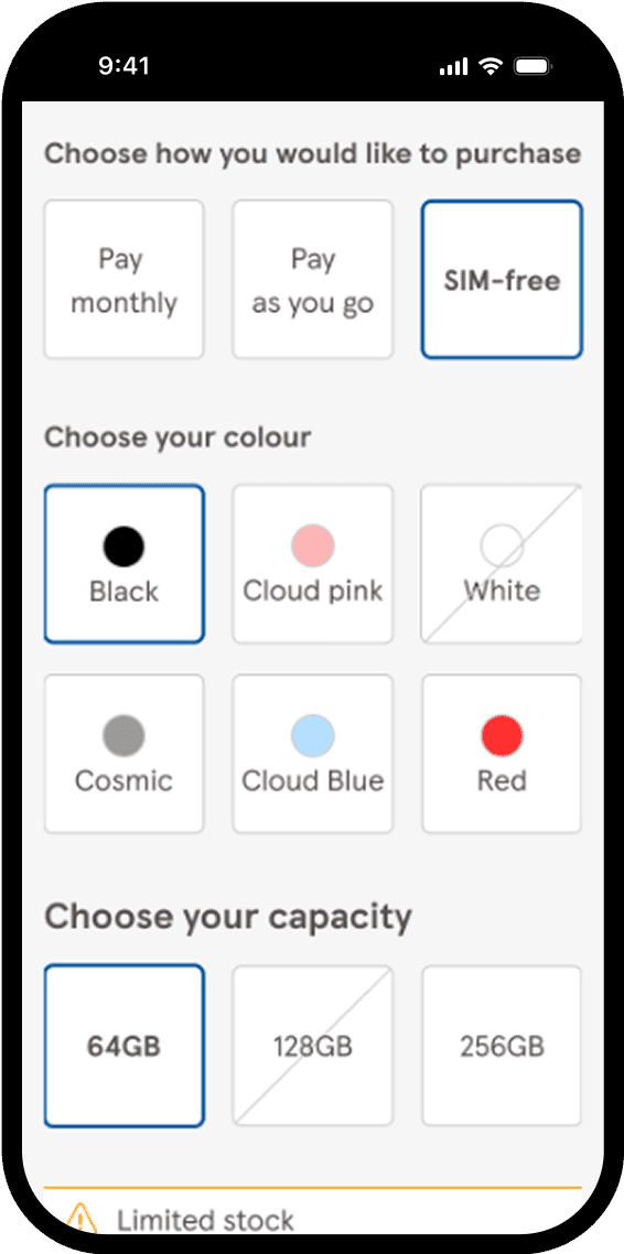
I began by designing the Pay Monthly screens first, as they contained the most options and information. This approach made it easier to create the Pay As You Go and SIM-free screens without complications.
For example, components could be removed for the SIM-free product pages as there was no need to display contract information or data usage options for this purchase plan.


Pay Monthly plan

Sim Free plan
By having an "Upgrade" button in close proximity to the primary button we could catch customers early.
The option to upgrade needed the user to login so that Tesco Mobile could determine if they were eligible for the upgrade. By moving the upgrade button under the "Add to basket" button we catch the users attention to log in and their upgrade options.
Once logged in, information such as when their contract would end and how much it would cost if they upgraded earlier would be shown on a separate screen and also where the main primary add to basket would have been on the product page.
Customer upgrade flow.

Customers can now check stock In-Store & Online, creating more purchase opportunities.
Customers shopping online were previously unable to view stock information, and if a product was out of stock, no options were provided to them.
With the new designs, customers can now choose to find a local store to check stock and purchase from or opt to be notified when the item is back in stock. I created the notifications with accessibility in mind, using icons rather than relying solely on colour.
Along with being able to view their local store for stock they can also view the store details such as address, distance, and opening times.
Flows showing the option to be notified when back in stock and viewing stock at your local store.

in-Store User Experience
Employees can now check in-store, warehouse & local store stock helping customers to still easily purchase.
One of the functionalities that was needed In-store was to easily show how many items were available In-store. This allows for a uninterrupted customer experience with helping the customer instead of going back and forth to check to see if they had the item available product. If it wasn’t available they could check the warehouse stock or view stock at a local store instead whilst still with the customer. Having options to view different stock availability meant it was less likely for the customer to leave empty handed.
The customer could have the decision to be notified when it was back in stock, go to a local store to pick the item up that was close to them or have it delivered from the warehouse.
In-store employee flow showing different options to view either warehouse stock, instore stock & local store stock. Also the option to notify customer when back instock either online or instore.

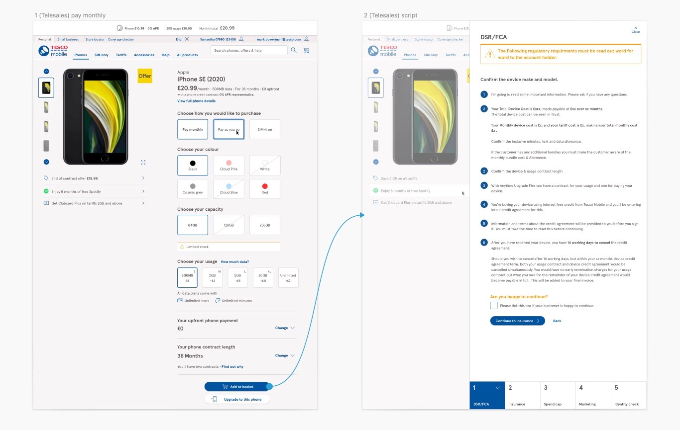
Telesale user experience
Telesales can now access the same screen as customers with no need to switch systems.
One of the problems telesale users had was that they were using a different system and would be seeing something different to what the customer would be seeing. This was a less than satisfactory customer experience as it would take time due to switching systems and could lead to confusion.
This was especially true for when they had to read out parts of the journey for the purchase of a device. They had to jump back and forth between tabs to read out parts of the script and view the product.
To resolve this I incorporated the step by step process to purchase into the product page for telesale users and by making sure the product page is identical to what the customer would be seeing would create less confusion, better efficiency and overall better customer satisfaction.
Telesales users can stay on the same page with a step by step process becoming available once adding the product to the basket.