


Design System
Working with and adapting the parent AXA design system for the new store.
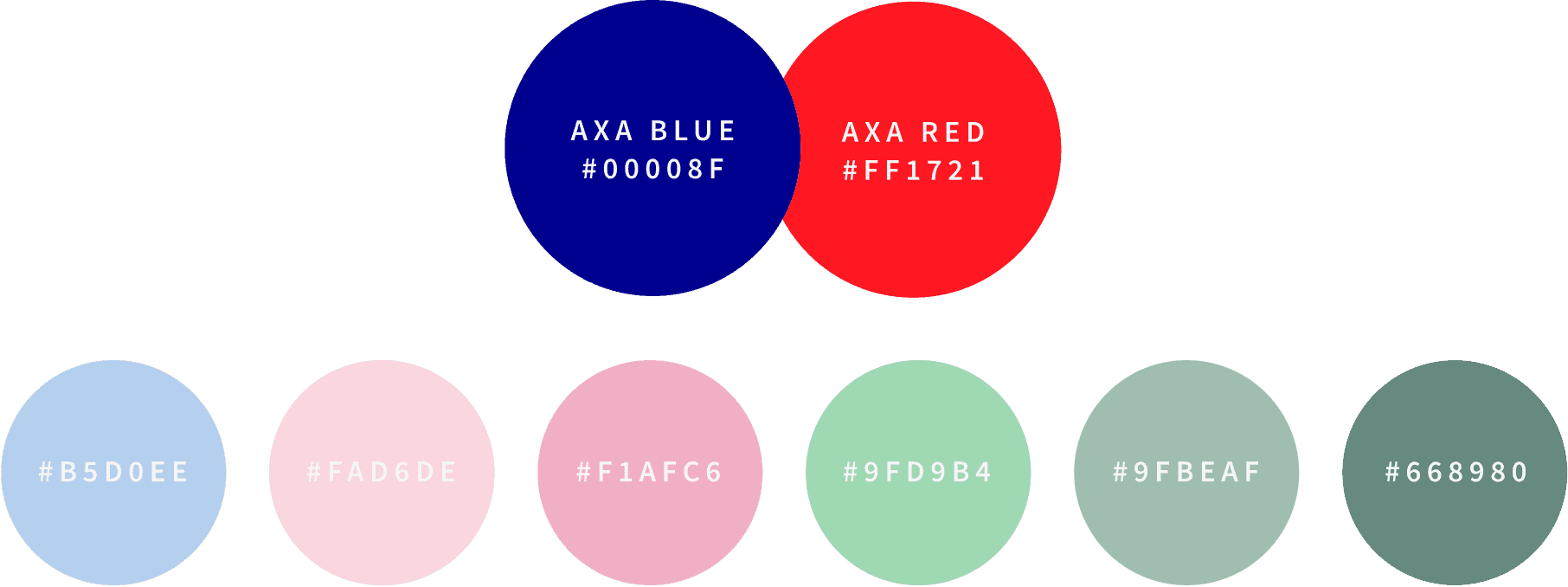
Being very familiar with setting up and structuring design systems it was easy for me to start using AXA's Design system which uses the setup structure of atomic design by Brad Frost.
Since I was creating an e-commerce website there were some components such as atoms, molecules, or organisms that had not been created inside of the existing AXA design library. With Sketch, I was able to set up a separate library and maintain the same component structure so that I could easily pull in from both libraries using plugins such as runner.


Wireframing
Making use of the desktop wireframes whilst also considering it's responsive structure.
This was a slightly different approach to wireframing as this time I was provided with some desktop wireframes to work from by another agency.
I created the hi-fidelity designs from the desktop wireframes but I also had to consider and create the new responsive designs and designs for other areas such as my account pages, basket page, checkout pages, register/login page, mini cart, quick search, and product list pages.
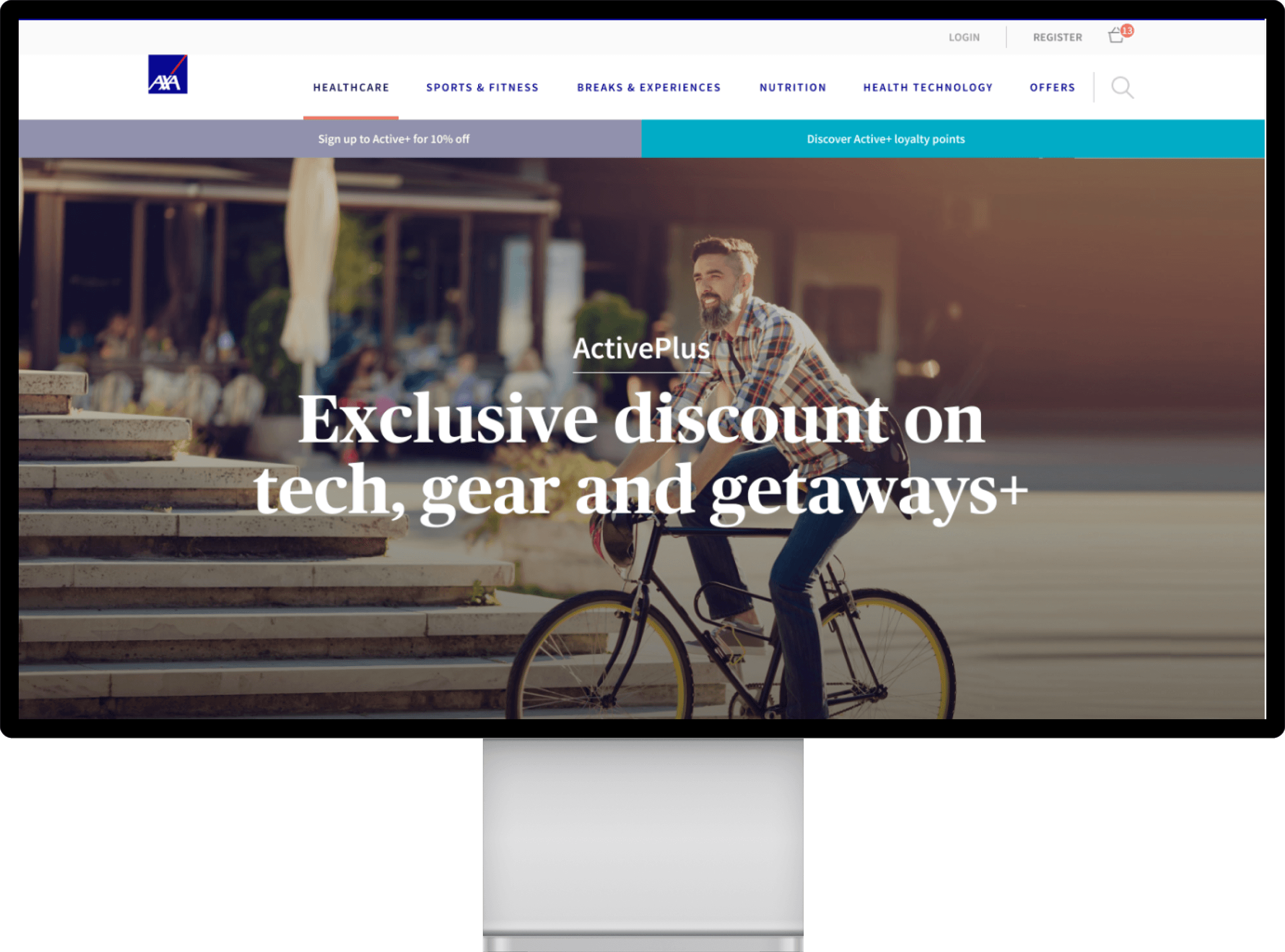
Homepage

Simple product page

PureGym Configurable product
Allowing AXA members to easily configure their PureGym membership.
Wireframes were created for the PureGym journey where users can search for PureGyms within the vicinity of a given location on a map.
The Gym Locator feature is accessible from the product detail page where users can change their home gym as well as choose their membership type and tier.
As this was a complicated journey that had many routes, wireframes were created as well as user flows and prototypes for mobile and desktop.
Configurable product

Multi Gym selected

Map overlay - Location

Map overlay - Location entered

Map overlay - Additinal gym

Interactive User flows
Creating a interactive user flow gave a clear overview of the user experience.
Creating user flows allowed me, developers, project managers, and stakeholders to view the bigger picture of the user experience and see the path(s) to a goal.
We could easily evaluate different entry points, tasks, and personas at an overall view where we could zoom in and out to see all screens or one at a time.

The pureGym detail page allowed the user to easily choose from a range of membership options.
• Searching for a gym: Searching for a gym is made easier with options to view on the map or by list format in alphabetical order.
• Choosing memberships made easier: A range of memberships can easily be viewed and changed on the detail page as well as in the process of choosing your gym without the need to load new pages or jump back and forth.
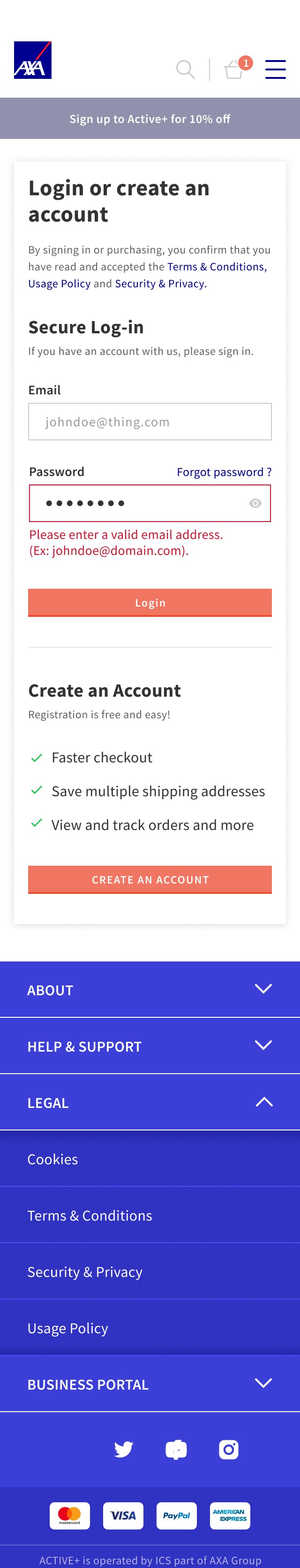
Mobile designs
A mobile-first approach gave me greater focus on user needs and essential content.
As mentioned before I usually create designs for mobile at the initial stage as this allows me to focus on what is important and necessary due to the limited screen estate.
Another major reason for mobile-first is that mobile internet usage is surpassing desktop usage and in some cases surpassing it in conversion rates.
Google will also primarily use the mobile version of the website for ranking and indexing so it makes sense to begin the UX design for mobile-first and make it mobile-friendly as possible.


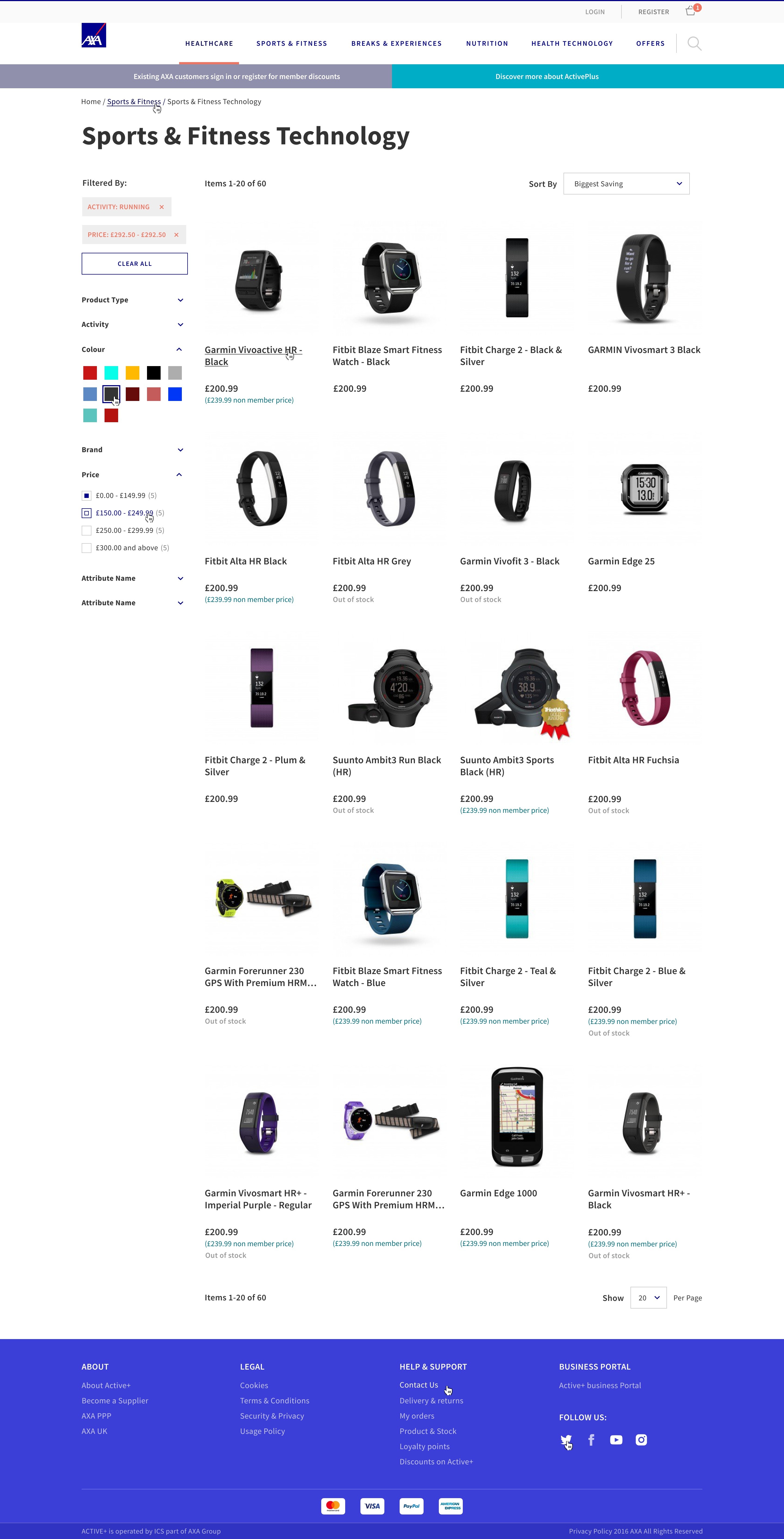
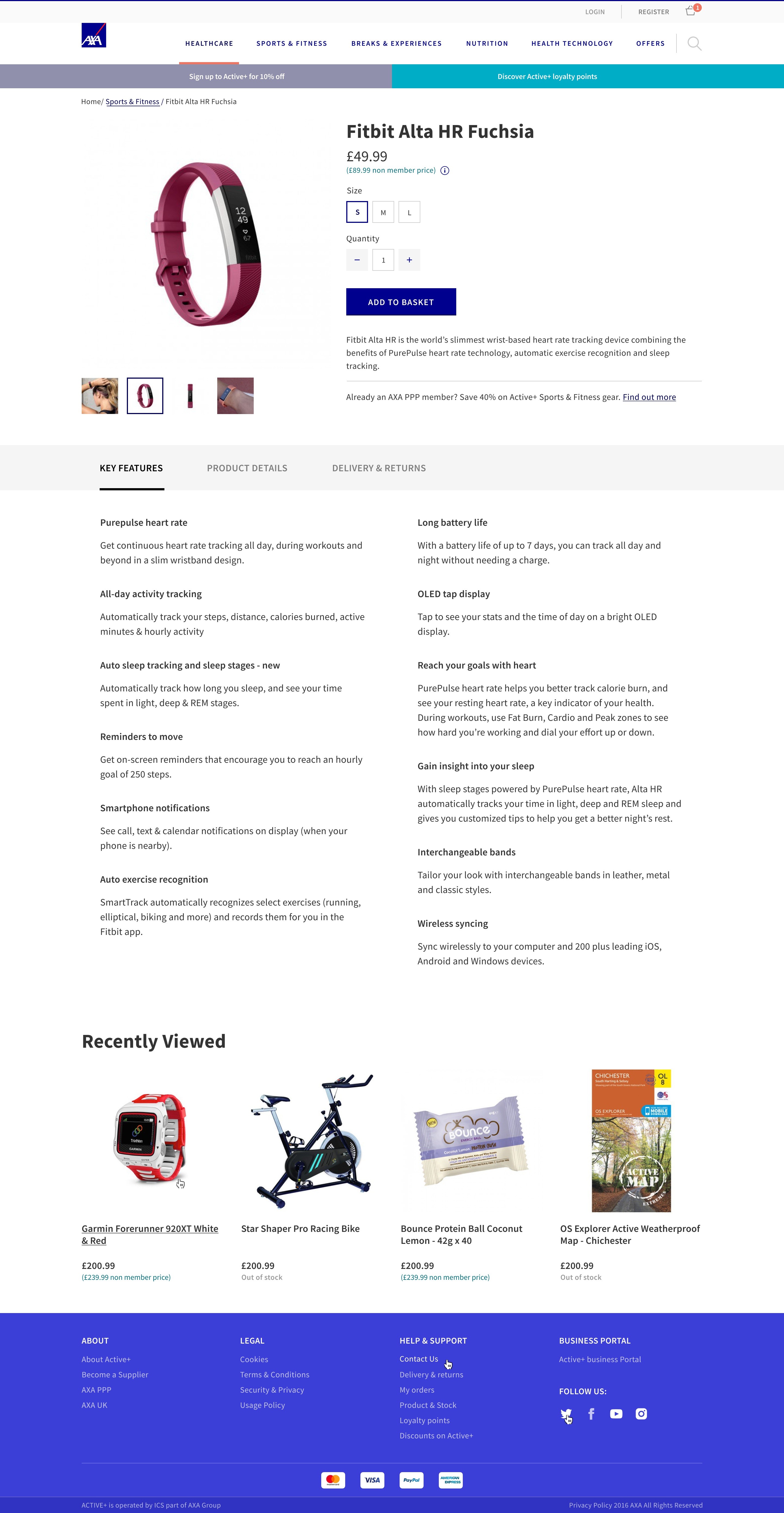
Areas worked on


Desktop designs
Desktop Designs.
Along with creating the many different areas of the website as shown below I also worked on creating good communication between designer and developer so that we're both on the same page and things run smoothly and efficiently as possible.
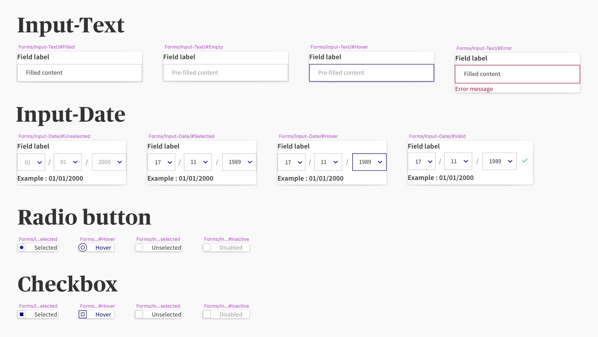
InVision has made this very easy allowing me to comment directly on designs and allowing developers to easily download assets when they need them. I like to create a style guide handover for developers so that they can get the fundamental baseline styles at the start of the project and this usually consists of buttons, typography, forms.
Homepage.


Category Page.

Category Listing Page.
Product Detail Page.
About Page.

Checkout.